
Your Color Palette Is Telling a Story — Is It the Right One?
Apr 20, 2026I love color. I mean, I really love it. I spend a lot of time thinking about it. Maybe more than most designers and definitely more time than a normal person.
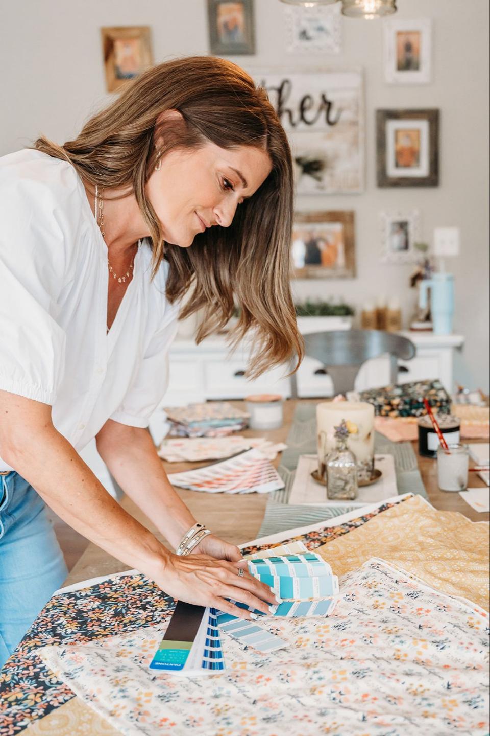
So, the other day, I was thinking about why color is so important to surface pattern design. I mean, yes, we want to create something beautiful and color can do that. But, it’s more than that. Color tells a story. It’s a personal story.
And that’s really important to remember as a designer. The story you tell has to appeal to the people your work is for. I mean, if you want to go deep with this, it really should be their own story. So, if you don’t know who you’re designing for, whose story you’re telling, you end up with a palette that speaks to nobody.
And doesn’t sell.
Color Speaks Before Anything Else Does
A buyer feels your palette before she reads your product description. Before she zooms in on the pattern. Before she even processes the design as a whole.
Color is first contact. And first contact is emotional.
That means your palette isn’t a styling choice — it’s a messaging choice. It’s the first thing that tells your ideal customer, “this one is for you,” or better yet, “this is you.”
If your collections keep getting passed over your palette might be telling the wrong story or it might not be finding the right people.
Finding Your People
Let’s make this concrete. Aunt Millie — our quirky quilter from a recent blog post — has a new niece. Baby Anthea. Anthea’s parents are deeply into all things British. Red telephone boxes, Paddington Bear, a fondness for the royal family that’s, let’s say, above average.
Aunt Millie is not looking for your typical collection. She’s got something very specific in mind. Saturated, cheerful tones in a limited range of true reds, blues, and whites. She loves puzzles and wants this quilt to be something she’s puzzled together from patterns that challenge her and tells a story about where little Anthea comes from.
What Aunt Millie’s Palette Needs to Say
- Celebration — this is a new baby
- Heritage — this connects to family and identity
- Warmth and cheer — British, but not stiff
- Range — enough variation for a piecework quilt to have movement
Shifting gears, we’re going to look at a different client’s story.
Inez is our home decor pro. Her current clients just left the suburbs and moved to a rural farmhouse. They’re exhausted. Not just from moving — from everything. The scroll. The noise. The overstimulation.
They chose that farmhouse on purpose. They want warmth. Quiet. A place to actually unplug.
They hired Inez and she knew right away that a bold post-modern wall or super saturated colors was not for them.
What Inez’s Palette Needs to Say
- Rest — this is where the nervous system settles
- Warmth — soft and sweater-y, not cold
- Earthiness — connected to landscape and natural materials
- Restraint — no color fighting another color for attention
Now, could the same designer make both collections? Sure.
But each palette tells a different story. Ultimately, the palette (and the design) that wins, starts with the person, not a mood board.
See the difference?
How Do I Know If My Palette Is Telling the Right Story?
Here’s the direct answer:
Your palette is telling the right story when it aligns with the emotional state your ideal customer is in when she’s buying.
Not the season. Not the trend. Not the Pantone Color of the Year. The emotional state of the buyer.

Which means before you build your palette, you need to know a few things about her. Things that are far more important to her than the season, trend, or color of the year.
The Four Palette Questions I Run Every Time
- What does she want to feel when she uses this pattern? (Rested? Energized? Nostalgic? Bold?)
- What is she moving toward — or away from — in her life right now?
- What room, object, or moment is this pattern going to live on?
- What colors are already winning with this exact customer in this exact market right now?
If you can answer those four, your palette almost builds itself.
If you’ve been staring at your own collections wondering “is this actually market-ready.” I made a free resource for you. Designing With Insight walks you through how to critique your own work like a buyer would without losing your mind over it.
The Single Biggest Palette Mistake I See
Designers build palettes that reflect their own taste instead of their customer’s.
Now, it’s entirely possible that your style and your customer’s style are the same. But I can tell you that color theory and design is a very broad category. It’s more art than science. (Pun intended.) There are reasons why some colors are classics and others are fads. Why hot pink shows up sparingly in most patterns. Why navy blue is a common color choice for clothing patterns.
Your taste is beautiful. Your taste probably got you into this business. But your taste alone won’t land the collection — because the buyer isn’t shopping for you. She’s shopping for herself, or for her client, or for the nursery, or for the farmhouse that’s finally quiet.
When I catch myself building a palette that’s just… mine? I stop. I go back to my ideal client avatar (ICA). I ask who is actually buying this, and what are they feeling?
Then I make sure the palette is for her.
Putting This Into Practice This Week
Try this, before the week is out:
- Pull up your most recent collection
- Write down — in one sentence — who it’s for and what she wants to feel
- Look at the palette
- Ask: does this palette match that sentence, or does it match my mood when I made it?
If the answer is “my mood,” that’s not a failure. That’s just a note. You can rebuild the palette around the customer and keep the patterns. Most of the time the art is already strong. The color of the art is what often moves people to purchase.
If you’re working in Photoshop and you want the technical side of palette building completely handled — swatch panels, global color updates, recoloring whole collections without rebuilding them from scratch — that’s all inside Photoshop Patterns Unleashed. It’s the workflow I wish someone had handed me ten collections ago.
If you remember anything, remember specific stories, about specific people, living specific lives right now.
Your job isn’t to pick the prettiest colors in the room. It’s to pick the palette that tells your customer “this one is for you.”