What is DPI? Why It’s Important to You?
Aug 18, 2025Don’t Pixilate Images (DPI): Avoiding the Dreaded Low-Res Warning
We need to talk about that moment. You know the one – when you've poured your heart into creating the most gorgeous pattern, uploaded it with confidence, and then watched in horror as your print-on-demand site delivers the digital equivalent of a slap in the face: "LOW RESOLUTION." Suddenly, you're questioning everything. Your skills, your software, your life choices, and whether you should have listened to your mother about becoming an accountant instead.
If this scenario makes you want to hide under your art desk with a stress-eating supply of chocolate, you're not alone. Today we're diving into the mysterious world of DPI – and no, it doesn't stand for "Design Panic Indicator" (though I totally get why you might think that).
Pixelation Panic: Why It Happens (And Why You Shouldn't Lose Sleep Over It)
Before we jump into solutions, let's talk about what this pixelation party-crasher is and why it shows up in the first place.
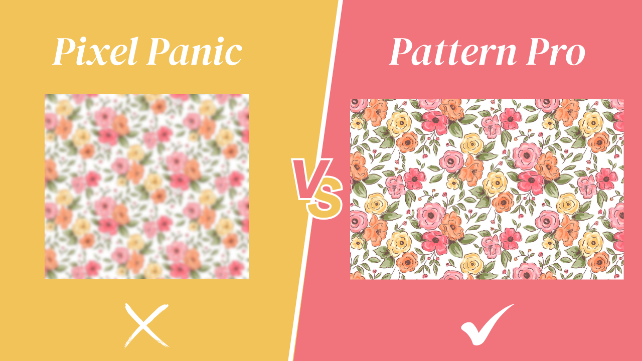
Digital art, unlike traditional painting, is made up of tiny squares called pixels. Think of it like a mosaic. From a normal viewing distance, it looks seamless and gorgeous. But zoom in too close and suddenly you can see every individual square pixel, making your masterpiece look like it was assembled by a caffeinated kindergartner.

When you're working in Procreate (or any digital art app), zooming in beyond your canvas's actual resolution is like looking at a mosaic through a magnifying glass. The closer you get, the more obvious those individual pixels become. It's not a flaw in your art or your app – it's just the nature of digital creation.
The key is understanding that what you see when you zoom in 400% isn't what your final printed pattern will look like.
The DPI Decoder Ring: What Those Three Letters Really Mean
DPI stands for "dots per inch," and it's basically telling us how many tiny dots of information are packed into each inch of our artwork. Higher DPI = more dots = sharper, more detailed images. It's like the difference between a pointillist painting by Seurat (tons of tiny dots creating smooth gradations) and a kindergarten finger painting (fewer, bigger "dots" of color).
For pattern designers, 300 DPI is the gold standard because it provides enough resolution for high-quality printing while keeping file sizes manageable. Most professional printing requires 300 DPI, so starting there means you're always ready for the big leagues.
The One-Size-Fits-All Solution That'll Change Your Repeat Pattern Game
Here's where I'm going to share the hack that changed everything for me (and hopefully will for you too):
Always create your canvas at 300 DPI and at least 3000x3000 pixels, no matter what your end goal is.
I know, I know – it sounds almost too simple to be revolutionary. But trust me, this approach is like having a Swiss Army knife in your digital art toolkit, especially if you’re working in Procreate. Need a mnemonic device? Try DPI = Don't Pixilate Images. Boom – you'll never forget it.
1. Flexibility is Your Superpower
When you start with a high-resolution canvas, you can scale down for any purpose without losing quality. Need a tiny icon for your website? No problem. Want to print a massive wallpaper? You're covered. It's like buying clothes in a size that can be tailored down – you have options.
2. Future-Proofing Your Art Career
You never know when that pattern you created for greeting cards might catch the eye of a wallpaper company. With high-resolution files, you're always ready for unexpected opportunities. I can't tell you how many times a client has come back asking for a larger version of something I created months earlier!
3. Professional Quality, Every Time
300 DPI ensures your repeat patterns look crisp and professional whether they're displayed on a computer screen or printed on fabric. It's the difference between looking like a seasoned pro and... well, not.
Making Your 300 DPI Canvas Work Harder (Not Smarter)
Now that you get how to live the 300 DPI life, let me share some insider tips to maximize this approach:
The 10-Inch Sweet Spot
At 3000x3000 pixels and 300 DPI, your pattern tile prints beautifully at 10 inches square. Need something slightly larger? You can stretch to 12 inches without noticeable quality loss. Beyond that, you might want to scale up your original artwork.
This size is perfect for most surface design applications. Whether you're uploading to Spoonflower or preparing files for licensing deals, you'll be in the professional zone.
Create a Template (Because Ain't Nobody Got Time for Manual Setup Every Time)
Here's a time-saving tip that'll make future-you send thank-you cards to present-you: create a template in Procreate.

Title it something memorable like "Repeat Tile High Res" (or "Don't Panic This is 300 DPI" if you're feeling cheeky). Set the DPI to 300, make sure your measurement is in pixels, and type "3000" for both width and height.
Boom! Now every time you open Procreate, you can click your template instead of manually entering settings.
Zoom Psychology: Managing Your Magnification Expectations
Reality check time: Seeing pixels when you zoom beyond 200% is completely normal. If you examined a newspaper photo under a microscope, you'd see dots too. That doesn't mean the photo is poor quality at normal viewing size.
Resist the urge to zoom in just to torture yourself. If you're working at proper resolution and reasonable zoom levels, your final pattern will be beautifully smooth.
The Print Reality Check
Never judge your pattern's quality based on extreme zoom levels. Your patterns should look smooth and professional when viewed at their intended size. If you're worried about how something will print, use tools like my Free Seamless Pattern Tester to preview your designs at actual scale.
Beyond DPI: Other Pixelation Prevention Strategies
While 300 DPI is your foundation, there are other factors that can affect your pattern's final appearance:
Brush Selection Matters
Some Procreate brushes are naturally more pixelated than others. If you're noticing rough edges even at appropriate zoom levels, experiment with different brushes. Sometimes switching from a textured brush to a smoother one can make all the difference.
Layer Management for Crisp Results
Keep your main pattern elements on separate layers when possible. This gives you more control over the final appearance and makes it easier to make adjustments without affecting the entire design.
Export Settings: Your Final Quality Control
When exporting your finished pattern, always choose the highest quality settings available. In Procreate, this means selecting PNG format and maximum quality for most applications.
Common DPI Mistakes (And How to Avoid Them)
Mistake #1: Starting Too Small
I've watched talented artists create gorgeous patterns at 72 DPI, only to discover they can't use them for print. Don't be that artist! Start big, scale down as needed.
Mistake #2: Resolution Roulette
Mixing 72 DPI and 300 DPI elements in one design is like pairing a ball gown with flip-flops – technically possible, but why would you want to?
Mistake #3: Zoom-Induced Anxiety
Stop zooming to 500% and having pixel panic attacks. Work at reasonable levels and trust the process.
Taking Your Pattern Skills to the Next Level
Understanding DPI is just one piece of creating professional patterns. Ready to dive deeper? My Procreate Pattern Collection Masterclass covers everything from composition principles to professional file prep.
Want to understand what makes patterns successful? My free Designing with Insight Email Course breaks down the five key elements every market-ready pattern needs.
Draw, Pattern, Inspire - Now!
Here's the truth: mastering DPI isn't just about avoiding pixelated patterns – it's about setting yourself up for success as a professional surface designer. When you nail these technical foundations, you can focus on what really matters: creating beautiful, marketable designs that sell.
Every professional pattern designer has experienced pixelation panic. The difference between hobbyists and pros isn't that pros never see pixels – it's that they know when to worry and when to keep creating.

So let’s go. Set up that 300 DPI canvas and get back to making magic. Your patterns (and your future self) will thank you when that "low resolution" warning becomes a distant memory.
Want more technical tips and creative inspiration delivered straight to your inbox? Join my free Weekly Eduletter: 3,2,1...Let's Design for practical advice that'll help you build a thriving pattern design business.