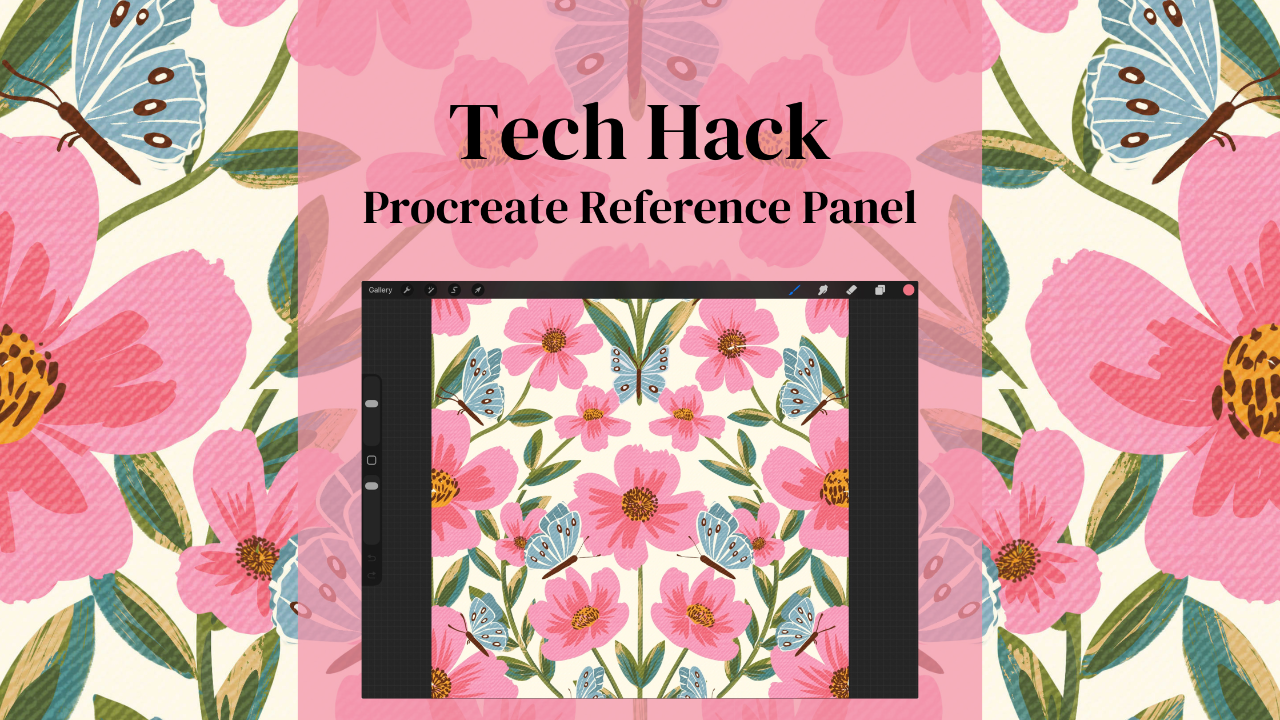
How to Use Procreate's Reference Panel for Perfect Pattern Design (Step-by-Step Tutorial)
Dec 29, 2025The Procreate Reference Panel Will Transform Your Pattern Workflow
Roses are red, violets are blue, here's another Procreate hack that'll change everything you do!
Okay, okay, I promise that's the last rhyme... for today at least. 😂 But seriously, this hack is so good, you're going to wonder how you ever lived without it.
This is one of Procreate's most underrated features and trust me when I say that it will transform how you work on patterns and pattern collections.
So you know how it is when you're working on details, squinting at your iPad, trying to remember what your whole piece looks like while you're zoomed in at, like, 400%? Then you zoom out to check the overall composition and... wait, is that whole section too crowded? Did you accidentally make everything lean to the left? Is your repeat pattern actually repeating correctly?
Cue the frustrated artist sighs.
If you've been there (and let's be honest, who hasn't?), you're going to love what I'm about to show you.
The Reference panel — Procreate's hidden gem.

The Procreate Reference Panel Is Cooler Than a Penguin's Toes
Here's what makes the Reference panel absolutely brilliant.
It shows you a real-time, zoomed-out view of your entire canvas — no matter how far you zoom in on your work. You can finally stop that endless zoom-in, zoom-out dance we've all been doing since, well, forever.
You can import your own reference images. Need to match colors from a photo? Want to keep your inspiration mood board visible while you work? Boom. Done. It's like having a vision board that actually helps you create instead of just looking pretty on Pinterest.
It's a game-changer for pattern design. For those of us creating surface patterns, this feature is basically magic. Keep your full repeat visible while working on intricate details, and say goodbye to those "oops, the repeat is completely off" moments that used to happen after you'd already spent three hours perfecting every leaf vein.
How to Activate Your Reference Panel (It's Easier Than You Think!)
Step 1: Raise the Curtain 🎭
Time to pull back the curtain on this hidden feature! Here's how to get your Reference panel on stage:
- Open your Procreate canvas (the one you're currently working on or start a new one to practice)
- Tap that trusty wrench icon in the top left
- Select "Canvas" from the menu
- Toggle on "Reference" and watch the magic happen
A miniature version of your canvas will appear, floating like a little window of wisdom on your screen. The show is about to begin!
Step 2: Set the Scene 🎬
Now let's get your cast ready. You're not limited to your current canvas — you can actually import any reference image you want!
- Tap the little reference window that just appeared
- Hit the "Image" button (it looks like a mountain icon)
- Choose any photo from your device
This is perfect when you're:
- Creating a pattern inspired by a specific photo
- Matching colors to an existing design
- Working from a sketch or mood board
- Following a tutorial or reference guide
Step 3: Stage Direction 🎪
Now that your reference has made its entrance, let's block out where it belongs in your performance space:
- Use the top handle to drag it around your canvas. Find the perfect spot where it's helpful but not stealing the spotlight.
- Drag the corners to resize the window. Sometimes you need a bigger presence, sometimes a smaller supporting role works better.
- Pinch and zoom within the reference panel itself to focus on specific areas of your reference image.
I like to keep mine in the upper right corner, sized just big enough to catch composition issues but small enough that it doesn't upstage my working area. Every great director knows where to position their elements for maximum impact. Experiment to find what works for you!
Step 4: The Showstopper Move 🎨
Okay, this part is where I literally squealed with joy when I first discovered it — this is the grand finale trick that brings down the house! You can pick colors directly from your reference image without ever leaving your canvas!
Here's how to perform this crowd-pleasing act:
- Hold your finger on any part of the reference image
- Watch the eyedropper tool appear like magic
- The color you're touching is now your active color!
This is HUGE for pattern designers. Remember that gorgeous sunset photo you want to base your summer collection on? Keep it in your reference panel and pull colors directly from it. Faster than a quick costume change between acts, and way more accurate than trying to eyeball it. Standing ovation, anyone? 👏

Real Talk: How This Transforms Your Pattern Design Workflow
Before I discovered this feature, I was spending SO much time zooming in and out that my Apple Pencil probably got dizzy. And don't even get me started on how many times I'd zoom out after an hour of detail work only to realize my pattern balance was completely off.
Here's how the Reference panel specifically helps with surface pattern design:
For composition: Keep your entire repeat tile visible while you work on individual motifs. You'll instantly see if you're creating awkward gaps or if elements are too crowded. It's like having X-ray vision for your pattern flow.
For color consistency: When building coordinating patterns (like in my Procreate Pattern Collection Masterclass), you can keep your main pattern visible as a reference while creating secondary designs. No more guessing if you're using the right shade of coral!
For detailed work: Zoom in to perfect those tiny details while keeping the big picture literally in view. Your patterns will have both meticulous detail AND beautiful overall composition. It's the best of both worlds!

Quick Tips to Level Up Your Reference Panel Game
Tip 1: If you're working on a pattern collection (and if you're not sure where to start, my Weekly Eduletter: 3,2,1...Let's Design has tons of tips!), keep Pattern #1 as your reference while creating coordinating patterns 2, 3, and 4. Instant cohesion!
Tip 2: Take a screenshot of your color palette and import it as your reference. You'll never lose track of which colors you're using, even if you accidentally tap away from your palette.
Tip 3: Working from a sketch? Import it as your reference and use the opacity adjustment to make it lighter or darker as needed. It's like having tracing paper that's smarter and won't slide around your desk.
Your Homework (The Fun Kind!)
Try the Reference panel on your next project. Seriously, just once. Whether you're creating a pattern, working on an illustration, or experimenting with a new style, give it a shot.
And hey, if you're ready to take your pattern design skills to the next level with more pro tips like this, check out my Procreate Pattern Collection Masterclass. We dive deep into ALL the Procreate features that'll make your pattern design process smoother than butter on a hot pancake.
Happy creating!