One Sure-Fire Trick to Discovering Your Artistic Style
May 19, 2025Ever stare at your iPad, Procreate open, and feel like your patterns are a mixtape filled with totally different sounds? One minute you’re laying down boho floral beats, the next you’re spinning a geometric minimalist track. Maybe you're stuck in a graphic design groove that just doesn't feel right or maybe you're struggling to find inspiration as you juggle breakfast chaos and nap-time hustles.
No matter where you are in your artistic journey, you're here because you're dreaming of turning your art into a chart-topping business. But if you have a portfolio that’s more mixtape than masterpiece, it’s tough to stand out. Let’s drop the needle on a solution.

Today, I’m sharing a game-changing tip to help you create consistency and craft a signature style that sings you. We’re diving into the magic of sticking to one color palette for a month. Ready to tune up your portfolio?
A Limited Color Palette Is Your Creative Anthem
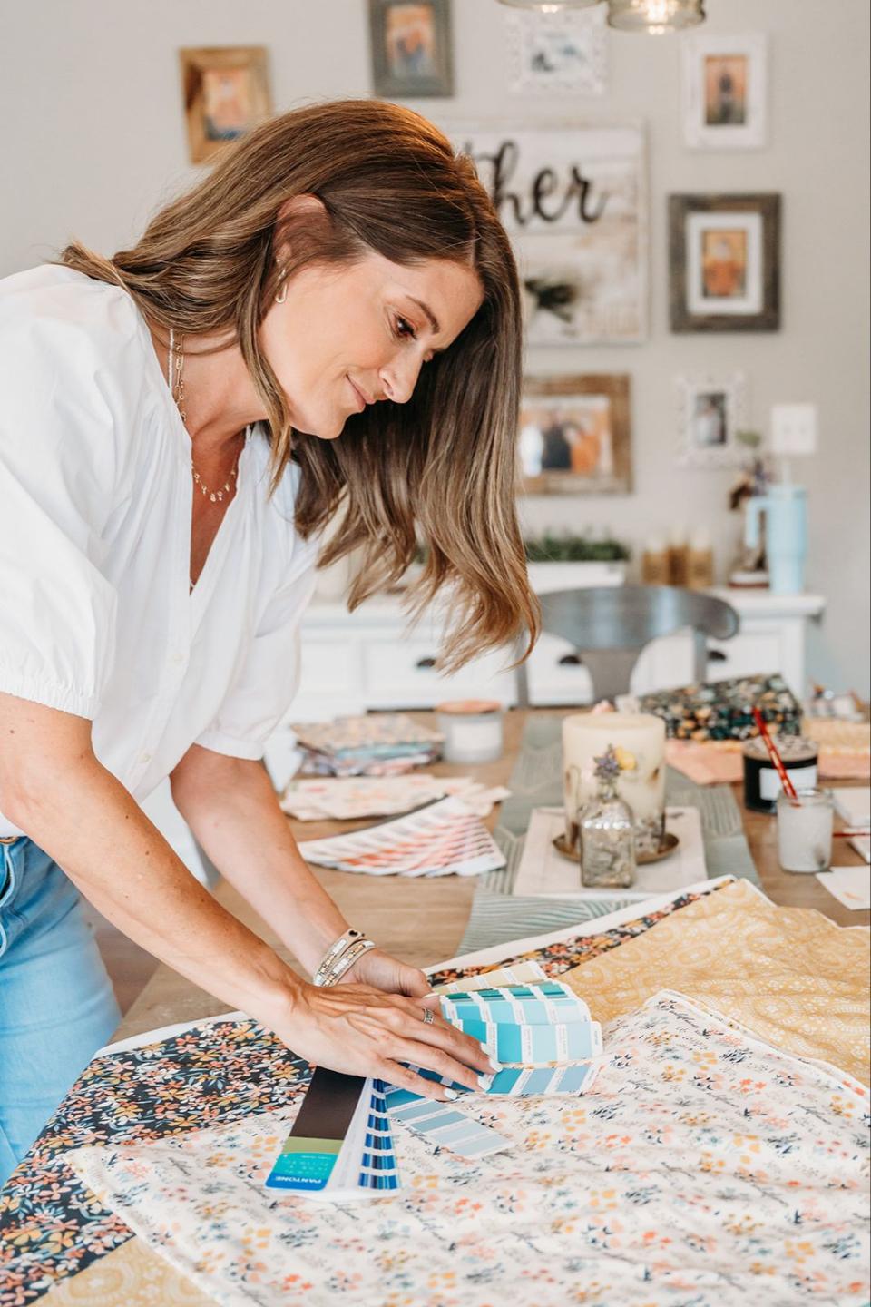
If you're mixing flashy disco neons with low-vibe acoustic pastels, your work may end up lacking a unified, signature feel. Don't get me wrong, you may have a unified look within your individual collections, but keeping that unified look across collections can be a big challenge. A consistent color palette can tie your work together and make your portfolio feel cohesive.
Committing to one palette for 30 days is a little like playing in a single key: it forces you to riff creatively within limits, helping you discover your unique style.
This approach isn’t just about creating visual appeal—it’s about building a professional edge. Clients and customers crave collections that flow. A unified palette does just that, and it gives your work a polished, professional feel.
Why Simplifying Your Color Options Works
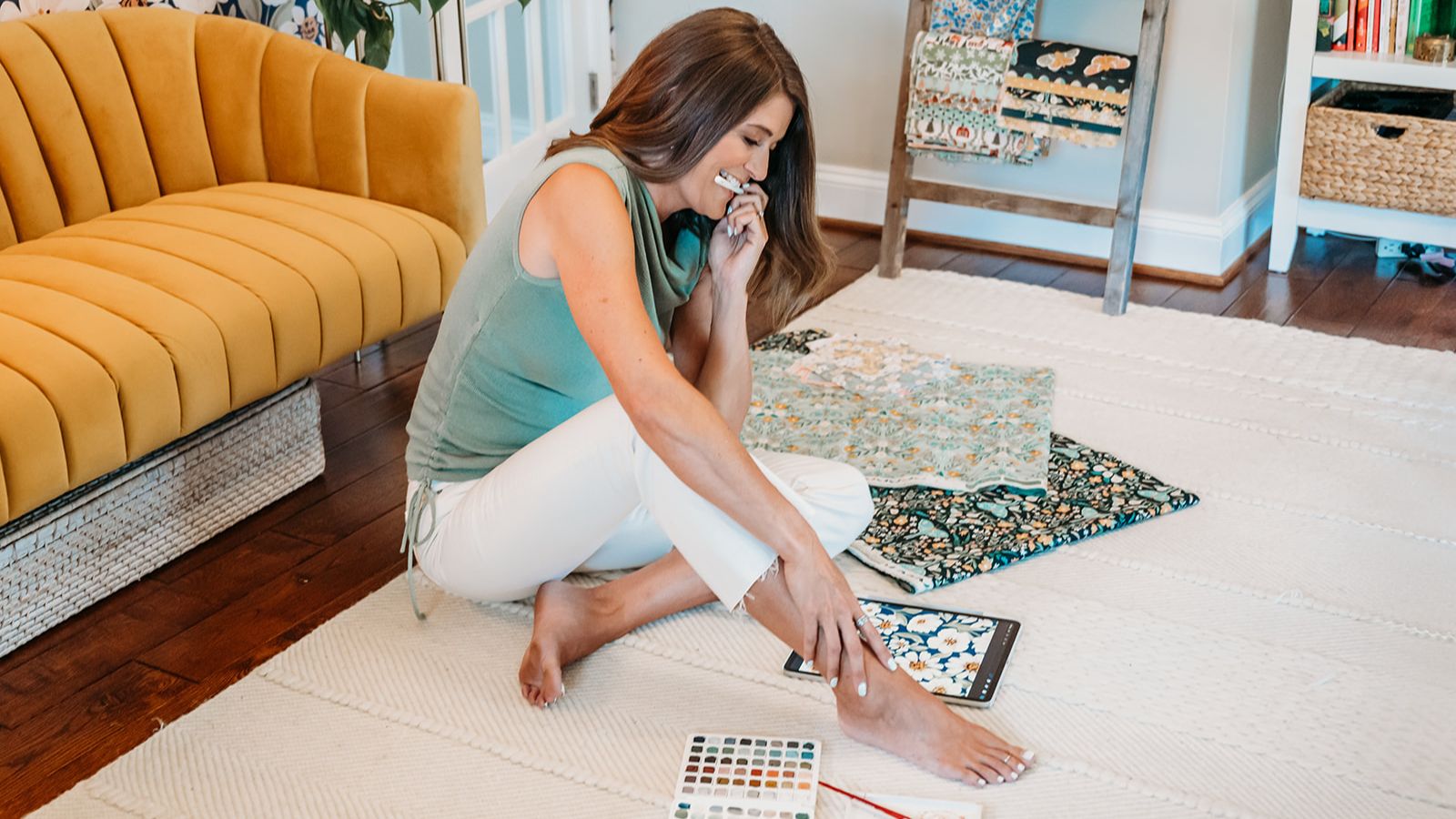
Honing in on color options trains your eye and your brain to notice patterns. You'll have an easier time spotting your creative preferences. Maybe, you'll make the connection that you're drawn to vibrant corals and sea foam greens because you love ocean-themed designs. Or maybe you'll realize that you need bold colors to complement your bold florals. As you draw with your limited color palette for the next 30 days, your other creative choices will start to form a melody, revealing the heart of your artistic style.
Another benefit - and it's one that I get pretty excited about—is that simplifying your color palette can give you MORE TIME! (I mean, who doesn't need more time? I know I do.)
But how is that possible?

Well, once you commit to using 10-15 colors for the next 30 days, you're going to find that suddenly you're spending a lot less time on those color sliders. You know that time you would have spent wondering if you should add more gray to your sea foam green? You can now use that time to create more drawings and designs.
Consistency saves time. Instead of agonizing over color combos, you’re free to focus on creating. When your color palette is already decided, you don't have to spend time on color coordination and planning. I don't know about you, but that's something that I found myself spending a lot of time on, especially in the beginning. So many of us are working to balance our busy lives and our art biz.
Color efficiency is a game-changer.
More time creating, less time second-guessing? Yes, please!
My Own Beginner Misstep
Let me take you back to my early design days, when my colors were all over the place - think rock clashing with classical, with a side of techno thrown in. Just kidding. It wasn't that bad, but I clearly didn't have a signature style—yet. One client tactfully called my portfolio “eclectic.” (I'm not embarrassed to admit it. "Eclectic" was code for a mess.)

Everything changed when I committed to using a limited color palette for a month. I found my voice. Once I committed to only using a few colors, my collections worked—not just individually, but all together, too. My collections started to represent me and my artistic style. And even better clients noticed. One even said, “This feels so you!” Those words were music to my ears.
Try it and I promise your portfolio will start to harmonize.
How to Pick Your Perfect Palette
Choosing a simplified color palette is like curating the perfect playlist—it’s personal, intentional, and sets the tone for everything you create. Here’s how to find your groove:
Social media keys: Scroll Pinterest and Instagram for color inspo that vibes with your style. Take some time to look at your favorites. Do you see a common color theme? Does a particular color show up over and over again?
Keep it tight: When building your palette for the next 30 days, limit yourself to just 10-15 colors. Pick a handful of main colors for your collection's core vibe. Add several accent colors for pizzazz. Make sure to include a few neutral colors, too.
Stay on beat: Don't overthink it. If you find yourself resisting this challenge, take a breath. It's going to be okay. Sometimes we artists get freaked out when we hear the word limit. Maybe you're worried that you're going to get sick of the colors you picked before the 30 days are over. Let me reassure you-just try it. You'll have the entire rainbow back at the end of 30 days (if you still want it). But trust me, simplifying things really can be freeing.

Pro Tip: Want to turn your palette experiments into sellable collections? Sign up to take my Procreate Pattern Collection Masterclass. It dives deep into creating cohesive designs that will keep your clients coming back for more. It’s packed with strategies to take your work from demo to headliner.
Tools to Amplify Your Palette Game
To make your palette sing, lean on tools that streamline the process. My Free Pattern Tester Tool is like a soundcheck for your designs—use it to preview how your colors and shapes play together in a seamless pattern.
If you’re working in Photoshop, my Easyscale Photoshop Script automates scaling, so you can focus on perfecting your palette, not wrestling with math. It’s like having a producer handle the technical stuff while you focus on the creative.
Consistency Is Your Creative Superpower
Consistency isn’t just about looking polished—it’s about building trust. Clients want to know you can deliver—not just once, but over and over. A defined style makes you more likely to become the headliner. A cohesive portfolio means you'll stand out, whether you’re pitching to fabric companies or launching your own shop.
Plus, a consistent palette streamlines your workflow. Just think, for a whole month, no more endless color tweaks. You’ll have more freedom to do what you love: draw beautiful patterns that light up your soul.
Ready to Find Your Style?
Finding your artistic style doesn’t have to feel like writing a symphony from scratch. Start small: pick one palette of 10-15 colors, stick with it for 30 days, and watch your signature sound emerge.
Ready to get serious about your art business? Check out my creative business templates, Artful Notion, and keep your workflow in tune.
What colors are you vibing with? Drop a comment below!