Landing Page vs. Website: Which One Does Your Art Business Actually Need?
Feb 19, 2026You've been putting it off, haven't you?
The whole "I need a website" thing has been living rent-free in your brain for months, maybe years, and every time you sit down to actually do something about it, you end up spiraling. Squarespace or Wix? WordPress? Holy cow, even Canva and Adobe offer something. Do you need a blog? A shop page? A newsletter? Should you have one of those little pop-up windows to get people to sign up? Should you have an about page with a photo where you look both professional AND approachable? (Spoiler: that photo doesn't exist. I've tried.)
Meanwhile, your neighbor's 2nd grader apparently "built her website in a weekend" and now has 500 newsletter subscribers. What. The. Heck?
Trust me. It's not you. Navigating the business side of the Internet is overwhelming.
And here's the thing no one tells you: you might not actually need a full website yet. And the fact that nobody told you that sooner? Honestly, it's a little bit mean girl of them.
What you might actually need is a landing page — one single, beautiful, does-its-job page that tells the world you exist, you're talented, and here's how to work with you. That's it. No seventeen-tab navigation menu. No existential crisis required.
But how do you know which one you need? And when does a landing page stop cutting it? Glad you asked, because we're about to break it all down — no tech jargon, no overwhelm, and definitely no judgment.
Let's get into it.
What Even IS a Landing Page?
Okay, first things first — let's clear up some confusion, because "landing page" sounds like marketing speak, and I know that makes some of you break out in hives.
A landing page is simply one single web page that does a specific job. Landing pages serve a lot of different purposes out there in Internet-land. But all you need to know is that your landing page tells people who you are, what you do, shows your best work, and gives them one clear thing to do next — whether that's emailing you, shopping your patterns, or signing up for your newsletter.
That's the whole enchilada.
No navigation menus sending people down rabbit holes. No "click here to read my origin story that starts when I first picked up a crayon." Just one focused, clean page that answers the question every potential client or customer is asking: "What do you do, and how do I get it?"
And here's the part that might surprise you: a landing page can look incredibly professional. We're not talking about some sad placeholder page with a "coming soon" banner and a stock photo of a sunset. We're talking about a polished, branded, this-person-means-business page that makes art directors and licensing clients take you seriously.
Why Starting With a Landing Page Is A Smart Move
I know, some of you are thinking, "But Mandy, won't people think I'm not legit if I only have one page?"
No. They won't. You know what people will think? "Oh good, I can find what I'm looking for without clicking through fourteen pages and three dropdown menus."
Here's the real talk: building a full website when you're just getting started is like buying a five-bedroom house when you're a single girl just out of college. Sure, it sounds impressive, but you're going to spend all your time maintaining rooms you don't even use instead of, you know, actually living your life. Or in our case, actually making art.
A full website with multiple pages, a blog, a shop, an about page, a resources page, a FAQ section, and a portfolio organized by season, style, AND colorway? That takes time. A LOT of time. Time you could be spending in Procreate creating the next collection that's going to knock an art director's socks off.
A landing page, on the other hand, you can build in an afternoon. Not a theoretical "afternoon" that actually means three weekends and a minor nervous breakdown. A real afternoon. Between lunch and dinner.
Tools like Canva (yes, Canva does websites now — I know, right?), Carrd, or even Linktree make it ridiculously easy. Most have free or dirt-cheap options. No coding. No hiring a developer who charges more per hour than your therapist. No watching seventeen YouTube tutorials while your eyes glaze over.
You can go from "I don't have an online presence" to "here's my professional page, thanks for asking" before bedtime tonight. And THAT is powerful, especially when you've been stuck in analysis paralysis mode for the last six months.
What Your First Landing Page Actually Needs (Hint: Less Than You Think)
This is where perfectionism tries to sneak in the back door, so I'm going to be very direct with you. Your landing page needs exactly four things. Not fourteen. Four.
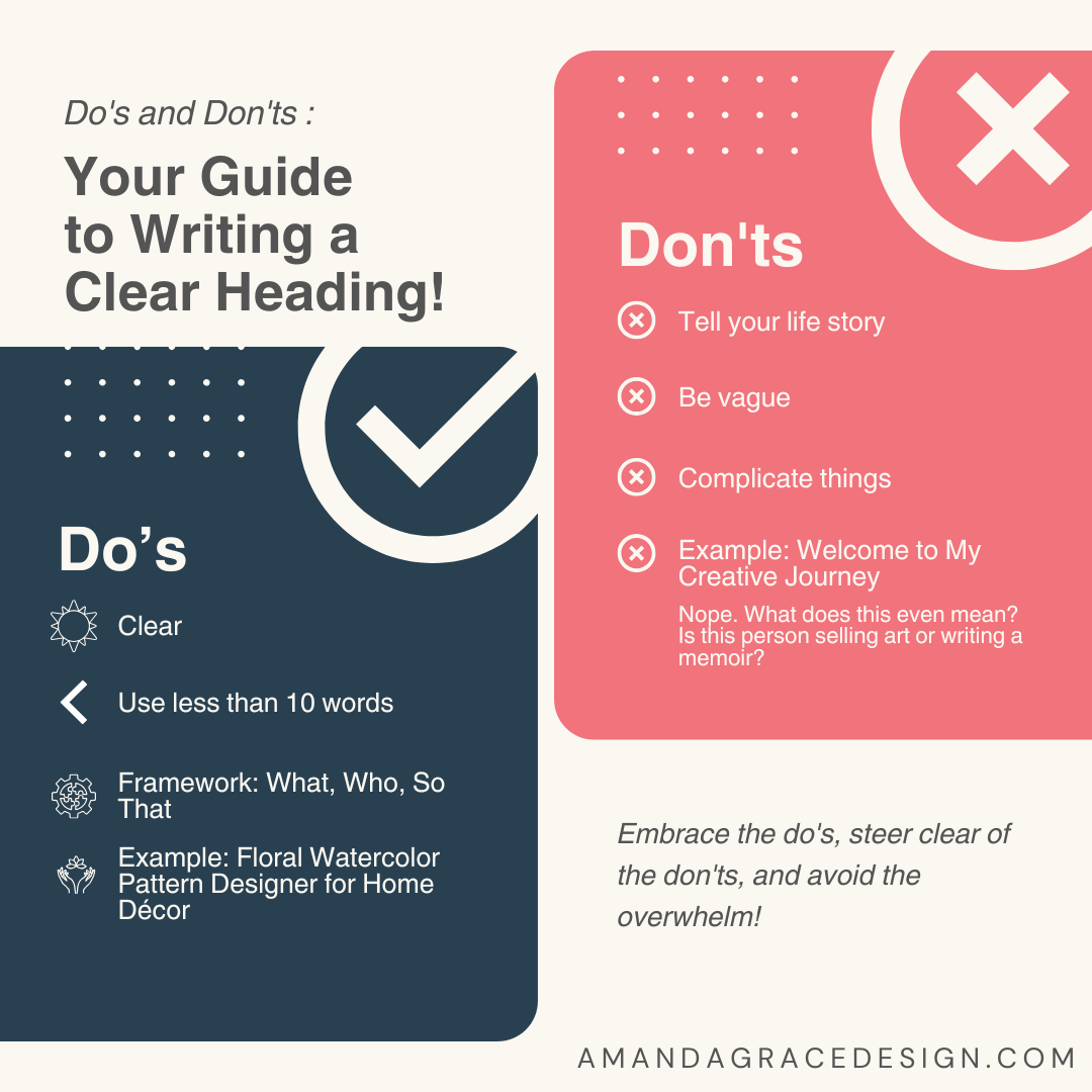
A Clear Headline That Says What You Do
And by "clear," I mean someone who has never met you, doesn't know what surface pattern design is, and has the attention span of a goldfish on espresso should be able to read your headline and understand what you offer.
Your headline is doing the heavy lifting here. It needs to answer "what do you do" in under ten words. If you're not sure what yours should say, try the "What, Who, So That" framework: What you create + Who it's for + So that they get what result. For example: "Hand-drawn florals for children's brands that feel like a warm hug." Done.
Your 3–5 Strongest Designs
Not your entire portfolio. Not every pattern you've ever made since 2019. Not the one you're "still tweaking." Just your absolute strongest, most you work that represents what you want to create more of.
Quality over quantity, every single time. If an art director lands on your page and sees five jaw-dropping patterns, they're reaching out. If they land on your page and see forty-seven patterns of varying quality, they're clicking away. Pick only the pieces that make you think, "Yeah, THAT'S what I do." Put those front and center.
One Short Sentence About Yourself
Skip the full autobiography. Right now, you need one sentence. Maybe two if you're feeling wild.
"I create hand-drawn florals that bring warmth to modern spaces." Boom. Done. Moving on.
One Clear Call to Action
This is where so many creatives trip up. They put seventeen different options on their page — email me, follow me on Instagram, check out my Etsy, visit my Spoonflower, subscribe to my newsletter, read my blog, watch my YouTube — and the visitor's brain short-circuits.
Pick ONE thing you want people to do and make it obvious. An email address. A shop link. A "contact me" button. Whatever is most important for your business right now, that's your one thing. Make it big, make it clear, make it impossible to miss.
And that's it. That's the whole page. Seriously. You're done.
The Four Signals It's Time to Graduate to a Full Website
Here's the beautiful thing about a landing page: it can live happily ever after for as long as you need it to. There's no expiration date. There's no website police who show up after six months and demand you upgrade. Your landing page can hold down the fort while you build your portfolio, test what sells, figure out what your business actually looks like, and get some real momentum going.
But eventually — and I want to emphasize the word eventually — you'll hit a point where one page isn't enough anymore. Here's how you'll know.
Signal #1: You Have Multiple Offerings
Maybe you're selling products on Spoonflower AND offering custom design work AND teaching workshops AND licensing your art. A landing page starts to feel like trying to stuff a king-size comforter into a twin-size duvet cover — technically possible, but nobody's having a good time.
When you have different services for different customers, you need different pages to organize it all clearly. Your wholesale clients and your Etsy shoppers are looking for different things, and they shouldn't have to wade through each other's content to find it. That's when separate pages start to make sense.
Signal #2: Your Portfolio Has Genuinely Outgrown One Page
And I mean genuinely. Not "I have twelve patterns and I want room to grow." I mean you have multiple collections, different styles, various colorways, and you literally cannot fit it all on one scrolling page without it turning into an infinite scroll of doom.
When your body of work needs organization — by collection, by theme, by product type — that's a signal you need dedicated portfolio pages. Your landing page can't do all that heavy lifting forever.
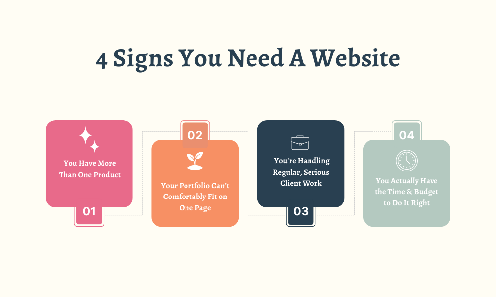
Signal #3: You're Handling Regular, Serious Client Work
Right around the time you've started to get serious, consistent interest from art directors and licensing clients, you're going to have to seriously consider a website build. Once you hit "Pro Designer" level, your clients will expect a new level of professional presentation. They want to see your range, understand your design sensibility, review different collections, maybe even peek at your process. They're investing real money, and they want to feel confident about who they're investing in.
A one-page landing page, no matter how gorgeous, doesn't give them the depth they're looking for during those bigger conversations. When you're pitching on a consistent basis to companies and studios, a full portfolio website becomes a professional necessity, not a nice-to-have.
Signal #4: You Actually Have the Time and Budget to Do It Right
This is the signal everyone ignores, and it's the most important one. Building and maintaining a proper website takes real time and energy. If you're barely keeping up with creating art, filling orders, answering emails, managing social media, and maybe also keeping small humans alive — it's not the right time.
A rushed, half-finished website does more damage to your brand than no website at all. Wait until you have the breathing room to do it right, because a polished, strategic website is worth the wait. A slapped-together one with broken links and pages that say "coming soon"? Not so much.
The Truth Most People Won't Tell You
Most artists build websites too early and then spend all their energy maintaining pages they don't actually need yet. They agonize over font choices and color schemes and blog post schedules instead of doing the work that actually builds a business — making art, building relationships, getting their work in front of the right people.
If you don't have a website yet, you're not behind. Read that again. You're being smart about where you spend your limited time and creative energy.
Start with a landing page. Put your energy into creating patterns and finding customers first. Build the thing that gets you out there TODAY instead of the thing that keeps you stuck planning for six more months.
When you hit those four signals? That's when you graduate to a full website. Not a second before.
And when you DO make that move, you'll be doing it with a clear sense of who your customer is, what they're looking for, and how to make every click on that site move them closer to working with you. Because remember — confusion doesn't convert. Clarity does.
If You're Still Not Sure How to Take Your Next Step
If you're sitting there thinking, "Okay, Mandy, but I don't even know who my ideal customer IS or how to talk about what I do" — I've got you.
My free Master the ABCs of Your Art Biz resource walks you through defining your ideal customer, your niche, and your unique value proposition using AI-powered prompts. Because trying to build a landing page (or a website) without knowing who you're talking to is like trying to write a love letter addressed "To Whom It May Concern." It's technically a letter, but it's not going to make anyone swoon.
And if you're ready to get serious about turning your patterns into a real, revenue-generating collection? The Procreate Pattern Collection Masterclass will walk you through creating professional, business-ready pattern collections — including how to prep those files for licensing and print-on-demand platforms. Because having a gorgeous landing page is great, but having gorgeous WORK to put on that landing page? That's the real power move.
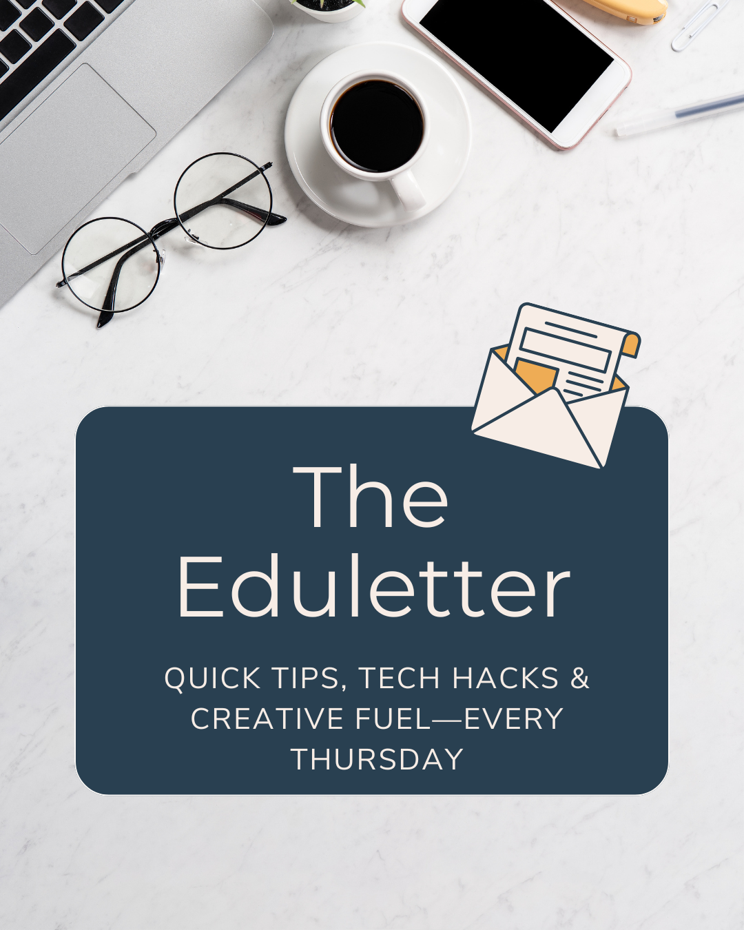
Oh, and if you want weekly tips, tech hacks, and the occasional pep talk delivered straight to your inbox? My 3,2,1...Let's Design! Eduletter is free, it's fun, and it's basically like having a creative business coach in your email every Thursday. No sad cheese cubes or awkward networking required.
Simple beats perfect. Every. Single. Time. Now go build that landing page.