
5 Things I Look for When Reviewing a Surface Pattern Portfolio (From 100+ Audits)
May 23, 2026I can tell, usually within the first sixty seconds, whether someone is ready to pitch clients.
After 10+ years in surface pattern design and over a hundred portfolio audits, patterns start to emerge. (No pun intended. Okay, maybe a little intended.)
I've reviewed portfolios for designers at every level — complete beginners submitting their first collection, mid-level designers who've been selling on Spoonflower for years and can't figure out why licensing hasn't clicked yet, and working professionals who want a second set of eyes before a big pitch. And the same five things keep coming up. Every. Single. Time.
So let me save you some guesswork.
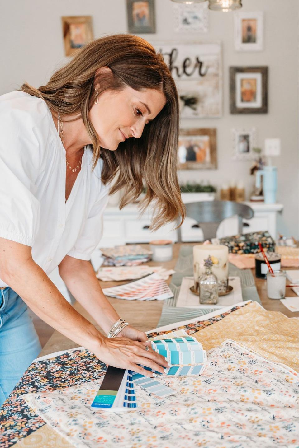
1. Cohesion — Does This Look Like One Designer (You) Made It?
This is the first thing I look at. And if you're a professional (or want to be) you've got to nail this.
Your portfolio needs a cohesive thread. I don't mean that you have to be the "Strawberry" person or the "Bee" person. That's not what I mean when I talk about cohesion.
I'm talking about having an intentional style and an intentional range. This is the difference between making deliberate design choices vs designing whatever you feel like on any given day.
If you want to know why this is so important, think of your favorite restaurant. Is it a pizza place? Burgers? Bougie French? Mine is sushi. The restaurant has a vibe: modern, simple, natural accents like bamboo and rice paper screens. If I walked in and the daily special was margharita pizza I would turn around and walk right back out.

Cohesion is about setting expectations and building trust. It's about getting your design "menu" right.
When I'm reviewing a portfolio, I always ask myself: If I came across these designs "in the wild," would I know it was the same person?
If the answer is no, that's the first thing you need to figure out.
2. Technical Execution — Are Your Repeats Actually Seamless?
You'd think this one would be obvious. And yet.
I've reviewed portfolios from designers who have gorgeous illustration skills, strong color sense, real artistic talent — and their repeats have visible tile lines.
A technically broken repeat doesn't just look unprofessional to a licensing client. It tells them you don't have a quality-checking process. And that matters as much as the design itself.
I check repeats at 25%, 100%, and 200%. I look at the corners. I look at whether motifs are clustering in one area when the tile repeats. I look at whether the negative space distributes evenly — or whether all the visual weight is crammed into one quadrant.
If you're not sure whether your repeats are actually seamless before they go into a portfolio, that's fixable. PatternPAL lets you upload a file and see it tiled in seconds — before it ever lands in front of a client. Not optional if you're pitching seriously.
3. Commercial Awareness — Is This Art, or Is This a Product?
This one is harder to explain, but you know it when you see it.
Some patterns are made for the maker. They're deeply personal, technically interesting, aesthetically cool — and completely unmarketable.
Why? Because they weren't made with a buyer in mind.
When I'm reviewing a portfolio for commercial potential, I ask: What does it go on? When does it go out? Who is the customer buying that product?
A licensing client, whether that's a fabric company, a home goods brand, or a stationery line, is thinking in terms of their customer. They need patterns that speak to a specific person in a specific product category. Your portfolio needs to signal that you understand that.

This is where a lot of talented designers get stuck. They have beautiful work that they can't seem to sell, and they think the problem is their art. It's usually not. The problem is clarity — about who the work is for and where it belongs in the market.
If you've been spinning your wheels here, the free Master the ABCs of Your Art Biz resource walks through some really important things you need to know about your design business. It will help you clarify: your ideal buyer, your niche, and defining what makes you and your designs unique so you stand out.
4. Collection Structure — Do You Have One?
A single great pattern is a flex. A collection of great patterns is a portfolio with sales potential.
What I mean is: buyers aren't licensing one pattern. They're licensing a coordinated collection and that’s the key to developing a successful portfolio.
When I review a portfolio for licensing readiness, I’m looking for evidence that you understand how collections function. That means:
- A hero pattern with visual presence and complexity
- Supporting prints that reference the hero without competing with it
- Scale variety (at least two different motif scales in a collection)
- A color palette that reads consistently across all the pieces
You don't need ten complete collections, though the more you have the more likely you are to sell them. You need two or three that demonstrate you know how this works.
5. Presentation — Does It Look Like You Take Yourself Seriously?
A portfolio is not just your art. It's your pitch. It's the first impression a licensing director, an art buyer, or a brand manager gets of you as a professional. And a PDF of flat repeat tiles on a white background with inconsistent naming conventions says: I'm not totally sure what I’m doing. I’m still figuring this out.
That's okay if you ARE still figuring it out! But if you're trying to book licensing clients or pitch to manufacturers, your portfolio presentation needs to be professional. Mockups. Product placements. A cohesive presentation that makes it easy for a buyer to see your pattern on their product.
Strong presentation requires intention: consistent mockups, a clean layout, and patterns presented at the right scale for the product category you're targeting.
This is also where your social presence plays a role. Buyers are checking Instagram before they check a portfolio PDF. They want to see how you present yourself, how consistent you are, and whether your aesthetic is clear at a glance.
If helping buyers find you on Instagram is something you're interested in, Get Discovered on Instagram is a great place to start. It's built specifically for surface designers who want their work in front of the right buyers, not just more followers.

So. Where Does Your Portfolio Land?
A lot of portfolios I review have one or two things that are genuinely strong and one or two things that are holding everything else back. That's completely normal. That's not a reason to get discouraged.
The difference between a portfolio that books work and one that doesn't is usually not talent. It's almost always clarity: cohesion, technical execution, commercial positioning, collection structure, and presentation.
If you want me to look at YOUR portfolio with these five questions in mind, that's exactly what the Art Biz Audit is for. I go through your work the same way I've gone through 100+ portfolios: specifically, honestly, and with a clear action plan for what to fix first. I’ll be honest with you, it’s an investment and I’ve done this on purpose. Unless you’re ready to invest in your business, you’re not ready for an Art Biz Audit.
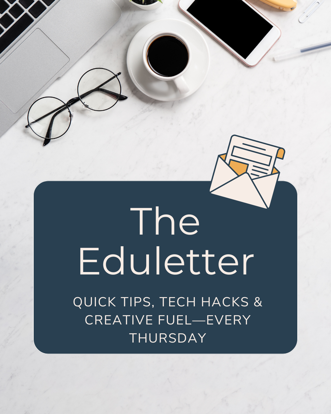
If you want more portfolio, pattern, and business tips in your inbox every Thursday, free, practical, zero fluff, sign up for my 3, 2, 1… Let's Design! Eduletter.
Now go do the work to get the right eyes on your pattern designs.